
Put contact information before decoration
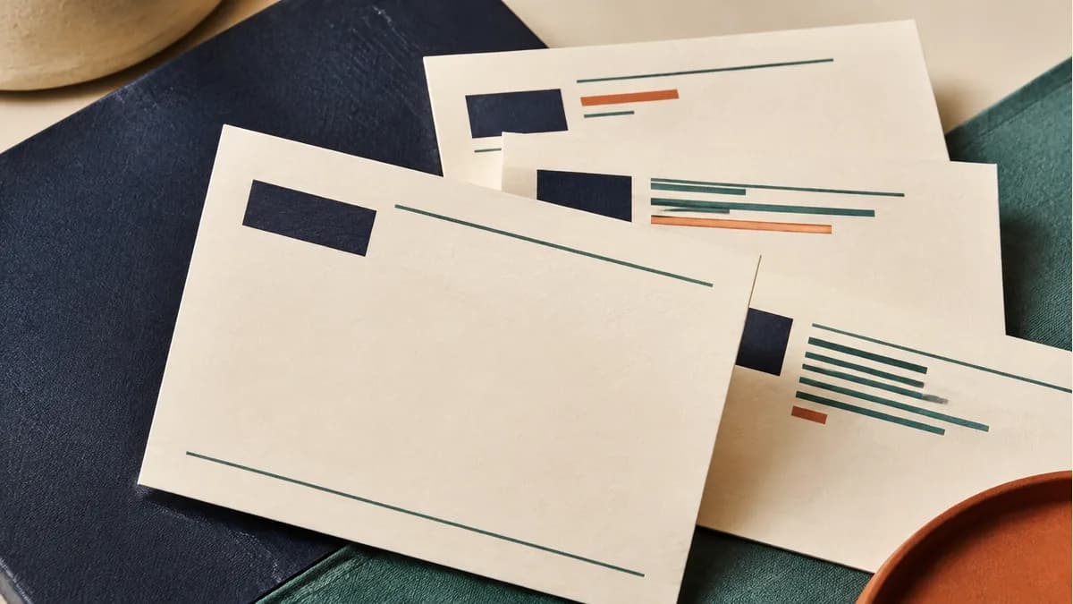
Decide which information needs to be found first: a name, a service or a booking route. Keep the business name and preferred contact method clear. Check both sides together so the reader does not have to guess where to go next.
Use actual information in the proof. Placeholder names can conceal spacing problems that appear when a longer job title or email address is inserted.
Test the design at card size
Print or view the proof at its finished dimensions. Check small type, thin lines, image crops and the trim area. A layout that looks spacious when enlarged may feel crowded on the card itself.
If several people share the design, test both a short and a long version of their information. Keep the structure consistent while allowing enough space for real variations.
Choose a finish for a reason
A finish can highlight an element or change the feel of the card. Ask which options suit the stock and artwork, how the production file should identify them and what proof is available.
If the reverse is used for appointments or handwritten notes, prioritize a suitable writing surface. A highly reflective or coated finish is not automatically the best choice for every part of a card.
Use digital links deliberately
A QR code can connect the card to a useful page. Give the reader a reason to scan it and test the printed result. Assign someone to keep the destination current; avoid tying a large order to a page that will disappear after an event.
Keep essential contact details in readable text when practical. The card should still identify the business if the reader does not scan it.
Keep the next reorder simple
Save the approved artwork, stock and finishing specification with the order reference. Recheck the content and quote for each new run rather than assuming an earlier price or schedule still applies.
Review business-card options and send your artwork and version quantities for a job-specific quote.